Dothan Housing Introduces New Logo

Dothan Housing rebranded Winter 2020 with a new logo and branding.
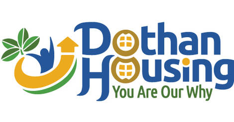
Our new logo brand is unique to Dothan Housing and reflects our agencies mission and the surrounding Dothan Community.
The colors incorporated in our brand blend the blue that Dothan Housing has previously used in our branding with a beautiful golden color inspired by Dothan High School’s colors. We chose to incorporate a complementary green color to represent the growth and new opportunities we hope to provide our residents.
Our new logo features a peanut plant, representing the seeds of growth we hope to plant with our residents. The stylized resident represented in our logo has their arms outstretched into a “Y” shape embodying our slogan “You Are Our Why.”
The golden arrow demonstrates upward momentum for our residents, culminating in the house that rounds off the top of the arrow representing our goal of empowering our residents to become homeowners. Finally, the stylized peanut within our logo represents the city of Dothan and the longstanding history of peanuts and peanut farming.
Our new branding captures the Dothan Housing’s spirit and will be used internally and externally to identify our projects. The logo brand was produced for us by creative agency, Brooks Jeffrey Marketing, Inc., an award-winning national firm serving Housing Authorities nationwide.
Established in 1984, Brooks Jeffrey Marketing provides integrated marketing solutions: advertising, branding, photography, public relations, promotional items, websites & social media campaigns to businesses, government entities & non-profits throughout the US. (www.BrooksJeffrey.com)


